Drops Mobile App Improvements Case Study
Drops is a language learning app owned by Kahoot!, a company specializing in learning-based games. Drops has 50 languages available for users to choose from and teaches thousands of vocabulary words and phrases through gameplay.
Drops Website
Drops App Listing
Note: Logos, colors, icons, and illustrations are pulled directly from Drops and their app. I did not do any rebranding. Outside of a few additional icons and UI adjustments, I did not create the visual design of this app.
Problem Statement
Special gameplay modes, progress trackers, and achievement rewards, all of which are are integral to the app, do not have fixed or easily discoverable places in the app's navigation. This makes it difficult for users to find and engage these features consistently, if at all. Not having gamified features and information in logical, prominent, and consistent places within the information architecture of the app stops users from interacting with them regularly and may be harming engagement.
How might we reconfigure the app's information architecture to increase both discoverability and findability for key, gamified app features and components?
Research
Competitive Analysis

I looked closely at three other language learning apps, Duolingo, Memrise, & LingoDeer, to get an idea of how they structured their content and the design of their user interfaces. I did a quick overall SWOT analysis of each of these apps to assess them.
Card Sorting
Since I was starting with an existing app and trying to address information architecture problems first and foremost, I deciding using open card sorting made the most sense to better align the structure of the app.
I started with an open sort to establish the names for the top, basic level categories for the nav and what fit under each of these categories. This better informed how the nav should be structured and it was very helpful to have them think aloud to understand their thought process. It also became clear at this stage that features specific to certain account types (premium or free) should be grouped together and directly interchanged between the two app views as much as possible, because it was hard to properly place them and define them otherwise.
After establishing the names of the categories, I decided to run a follow-up closed card sort to confirm the choices I landed on were working well, though tree testing could have also been used to validate this instead. I also ran a closed card sort using just icons when I decided to remove the labels from the bottom nav. This test led to a change in icon for the Achievements tab to make it clearer what a user would find under it.
Usability Testing & Interview
I observed users completing a few tasks using the current app design and asked them to think aloud as they did. These are the tasks I used:
- See if there are any languages you might be interested in learning.
- (In their chosen language) See if there are any units that interest you.
- Find a unit that will teach you vocabulary related to the weather.
- How do you track your progress in this language?
I also asked a couple of interview questions. The questions I asked were more general about language learning and to gauge their impression of Drops. These questions were:
- If you were just starting out learning a new language, what kinds of words would you be interested in learning first?
- How would you describe the Drops app to a friend?
Acknowledging Constraints
This is a self-initiated case study done from outside the company. There is a lot of data not available to me during this process that Drops would have internally about both their user base and their business goals, which would have undoubtably impacted how I chose to solve these UX problems to align with the company's needs overall.
Create
Information Architecture
Revised Navigation
 Original Bottom Navigation Bar
 Revised Bottom Navigation Bar
Using the information gathered while researching, I made revisions to how content within the app is structured. This included adding additional pages to make the bottom, main navigation more broad and flat while also restructuring content on some already existing pages. I moved the profile page to the top nav to allow more room for these additional pages on the bottom nav. I also made design changes to the bottom nav, removing the labels and enlarging the icons to give them more visual weight.
New Page Suggestions
 Review Exercises Page
 Achievements Page
 Audio Mode Page
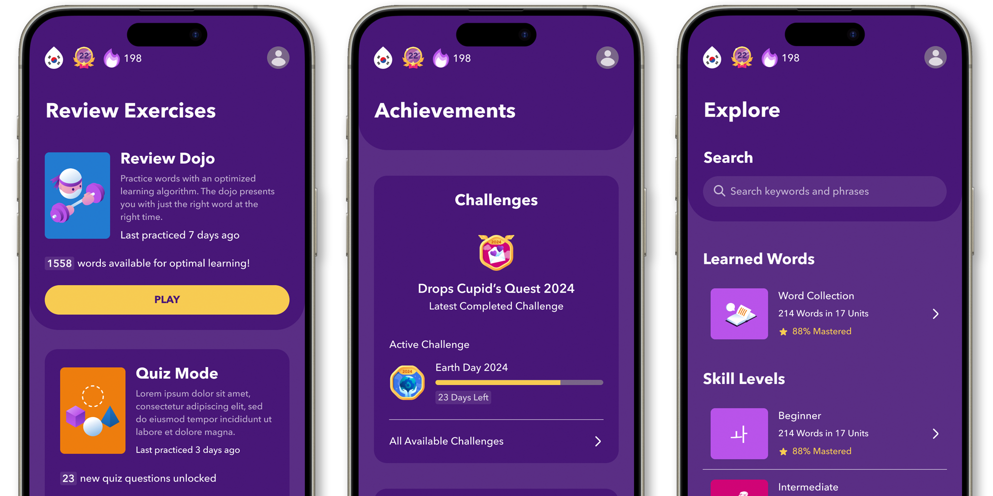
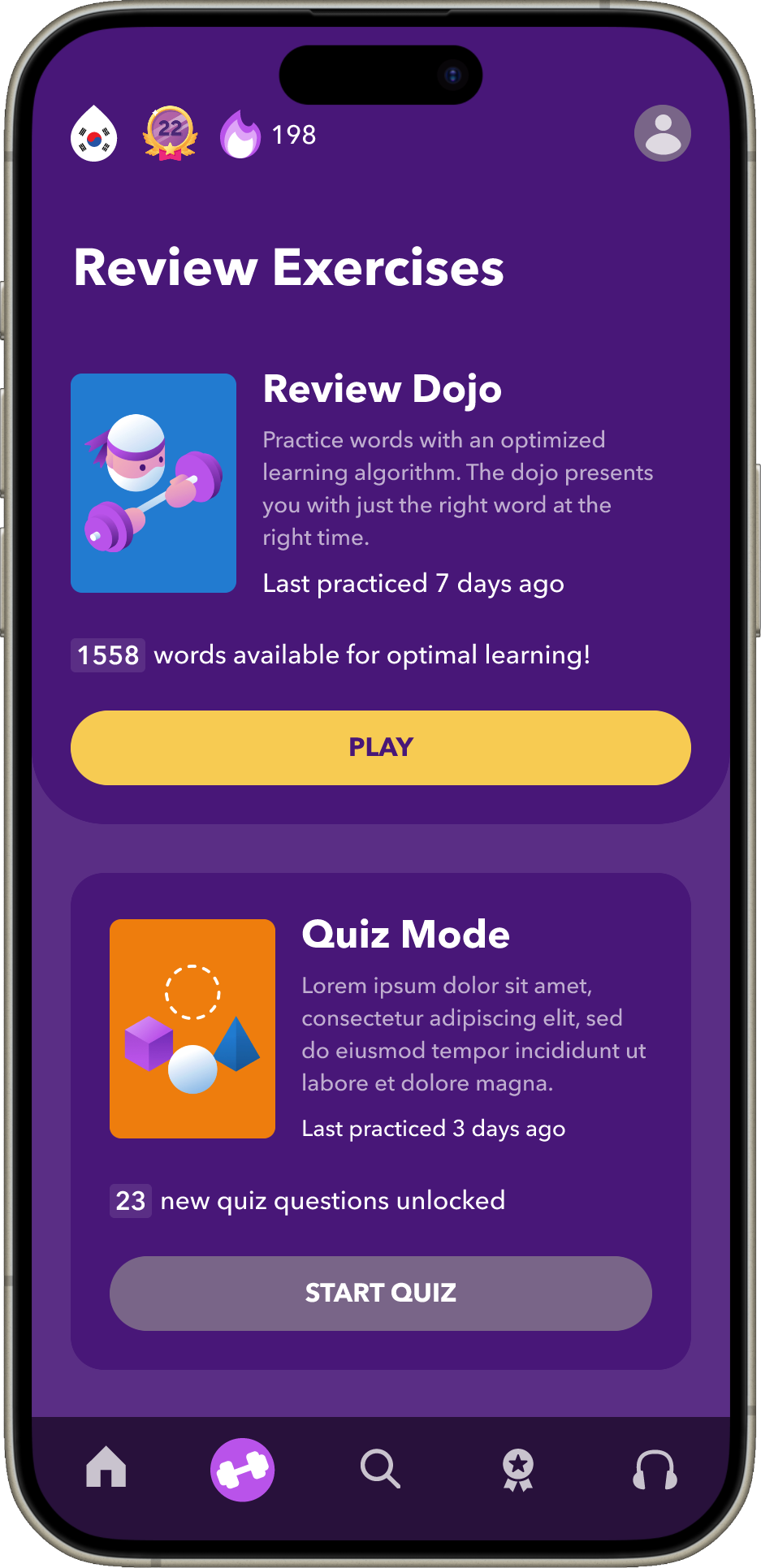
Review Exercises are gameplay modes that give users more personalized sessions. These are located in a couple of different places in the original app structure but do not have a distinctive place in the nav, forcing the user to remember where to find them each time. Creating a tab specifically for Review Exercises gives these gameplay modes higher findability while also reflecting how important they are to the user experience. By highlighting them more prominently, we are also increasing their discoverability for users that are not already aware of them, which could increase their engagement with the app.
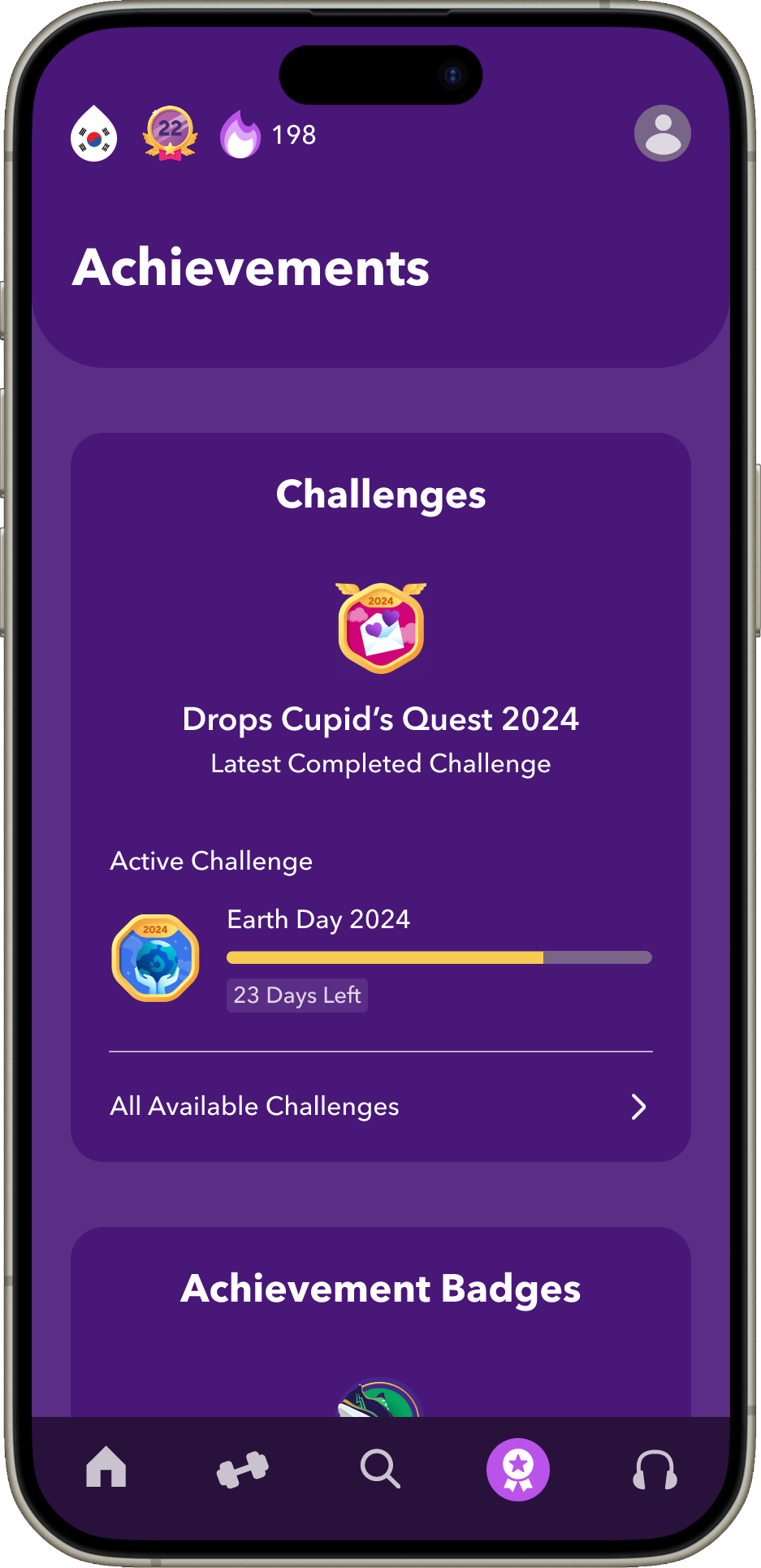
Achievements and learning progress in a language in Drops are tracked several ways. Currently, these are housed in various, separate places in the app but I believe keeping them together and creating an Achievements page could help with engagement and time in app by further gamifying it. In addition to this tab, I decided to keep the level and streak indicators in the top nav because these felt like important statuses for progress that the user should always have easy visual access to. I also at this point changed the verbiage of milestone that the app currently uses to level because I kept using level to describe the concept of milestone to others and felt like it was better to switch to the immediate get.
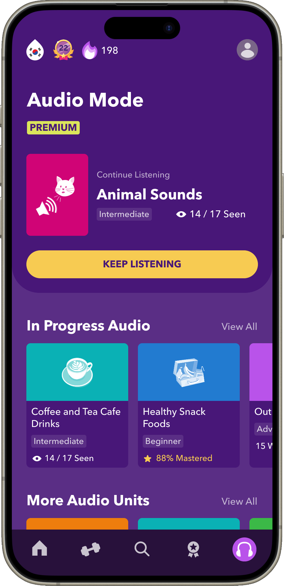
Audio Mode is an app feature that is currently only available to premium users but is not highlighted as such anywhere in the app. In fact, for premium users there are currently 4 items in the bottom nav since the 5th page for upselling to premium is not visible to them. In this revision, I am proposing that the 5th nav spot be used to highlight this feature so premium users see the benefit they are receiving and also have very easy access to it so they can quickly start studying handsfree on the go.
Improved Categories and Exploration
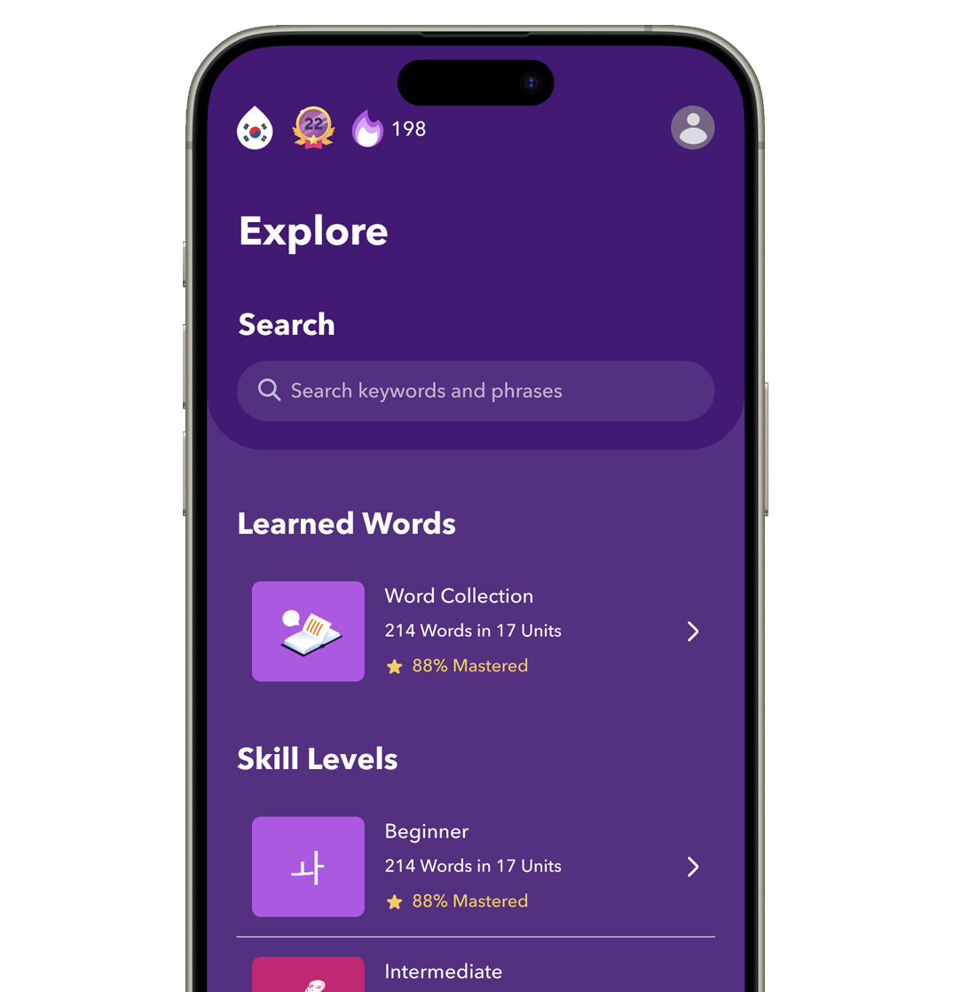 Explore Page
An issue that came up with some of the users I spoke with is that they would like to start out learning words of a certain skill level rather than find a certain topic. This is data that Drops does have because all units are labeled with a skill level, however, there is currently no way to sort by skill level. To bridge this gap, I added skill levels as categories on the Explore page to allow for this sort so users can see words that fall under their current level. I also left the Word Collection on this page because it is not a gameplay mode like the other review exercises, but is instead a way to search through words you've learned which fit perfectly under Explore.
Free vs. Premium Experiences
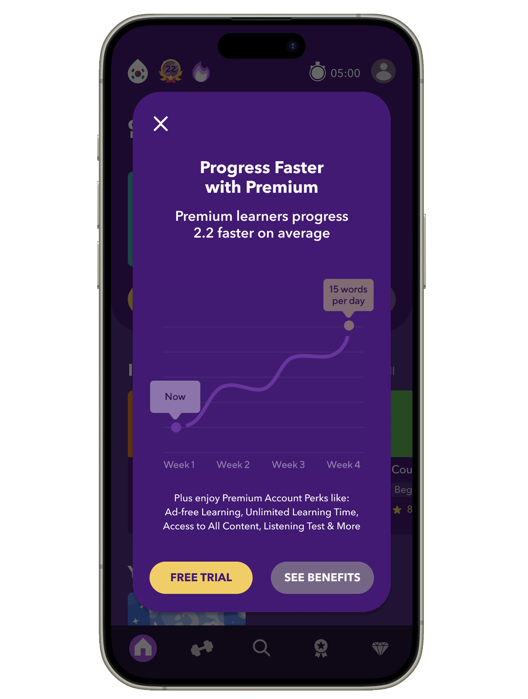 Pop Up Premium Account Ad
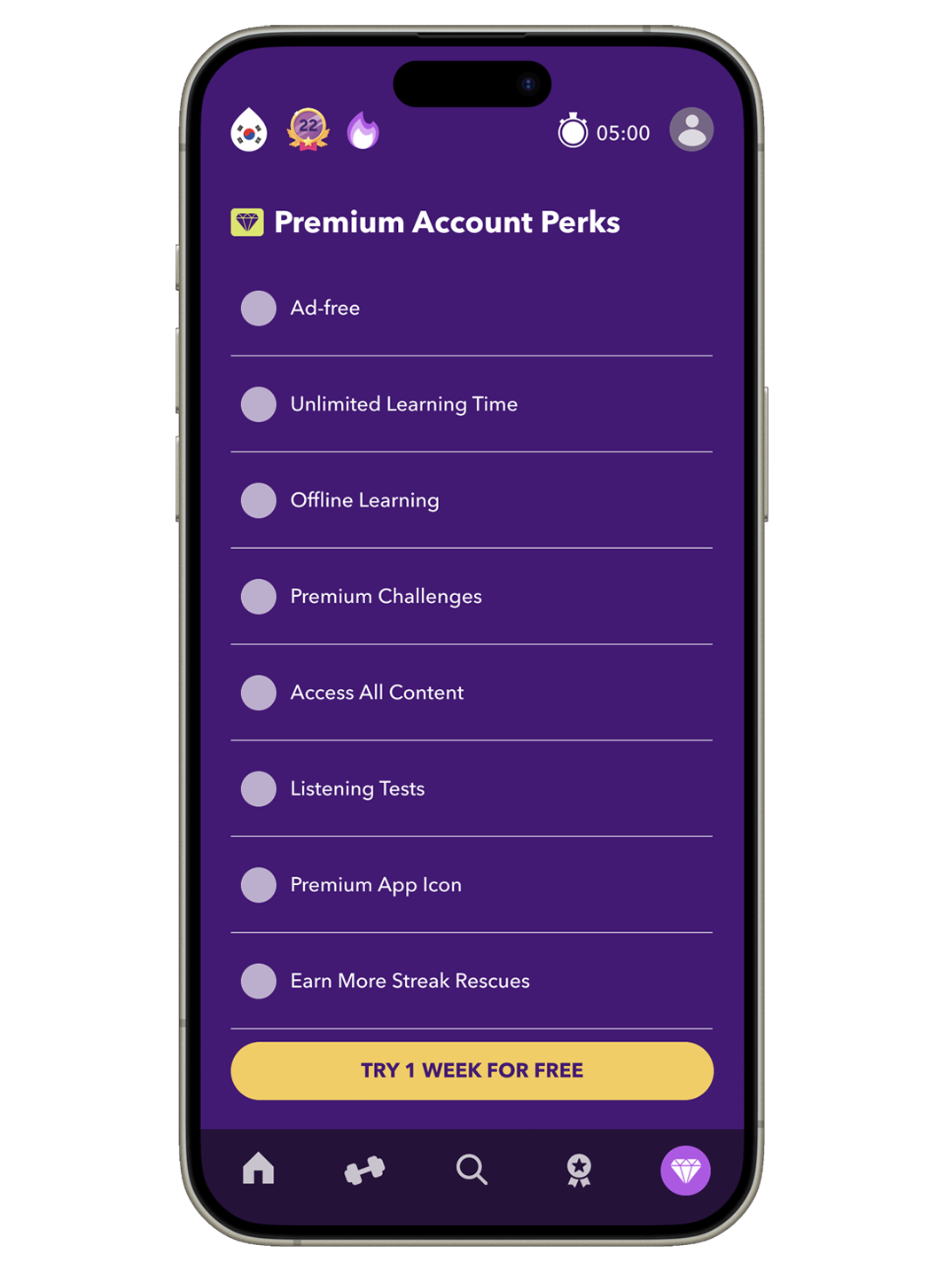 Premium Account Benefits List for Upselling
At the time of this project, Premium Account features and benefits are not listed anywhere within the Free Account's app view, missing out on a big opportunity for upselling premium account upgrades. Premium features are, however, listed within the Profile tab of Premium Account holders, so I took that list and added it to the Premium tab on the main nav that Free Account users see. I also created a pop up showing the learning progress graphic Drops is currently for upselling and added buttons for starting a free a trial or going to the Premium Page. Premium Accounts, as mentioned above, have access to the special Audio only studying feature and I made this a permanent part of the bottom nav for Premium users.
Card & Other Design Improvements
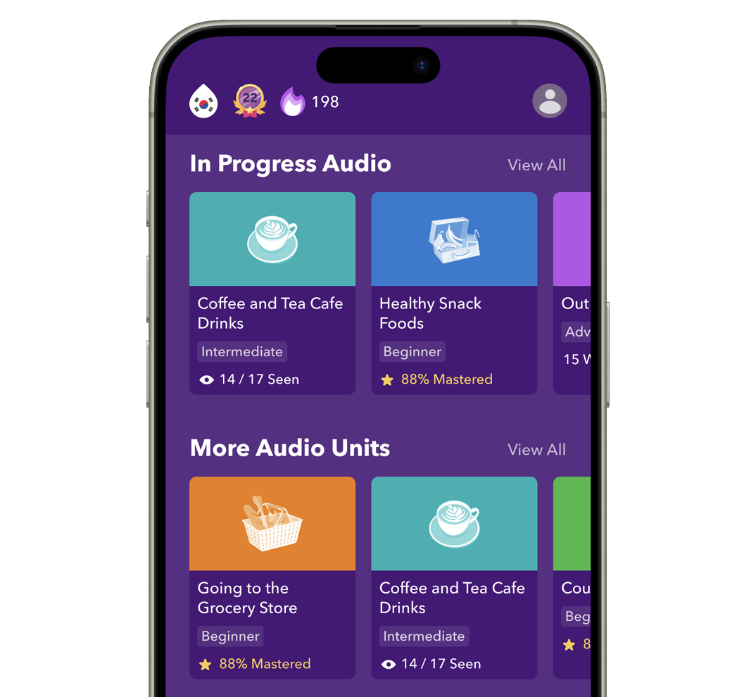 Revised Unit Card Design
 Unit Card Landing Page
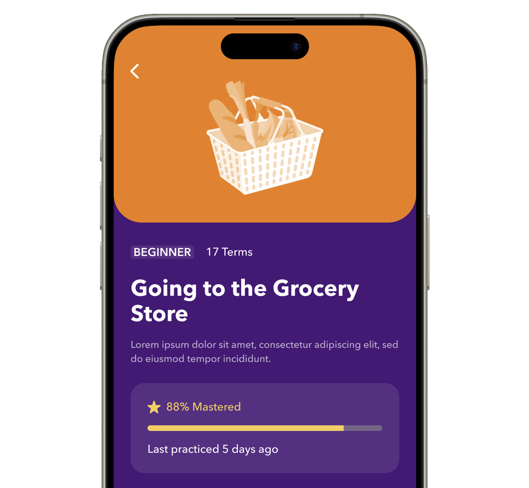
Cards for units a user has begun learning previously had a progress bar that was either white or gold located right at the bottom of the card's image. However, it was not easy for users to discern what these were tracking, nor was the change in color or it's presence always easily noticeable either. To rectify this, I removed the status bar and instead used a written status paired with an icon and word to indicate progress and what kind of progress. I kept the color change between the white learning phase and gold mastering phase because I felt this could add to gamification and engagement with the app. Then, I left the progress bar still visible on the its landing page where there is more room to have both the bar and the progress label to make it obvious what it is indicating.
While creating a Figma prototype for Drops, I also streamlined and adjusted the design of some UI elements and changed the look slightly while still using Drops' branding and style.
