Ingrain Mobile App Case Study
Ingrain is a concept for a mobile app for creating and reviewing user generated flashcards. The name of the app was chosen because of the meaning of ingrain: to firmly fix or establish a habit or idea in a person, deeply embedding into them until it is difficult to change. With consistent use of the app over time, the information a user studies will become ingrained in them, allowing them to put it to use in their real life to achieve whatever goal they are working toward.
Project created using Figma, Adobe Illustrator, and After Effects.
Problem Statement
Apps for studying and review can often have many complex features and settings. This makes it difficult for users to navigate, understand, and utilize the app's capabilities without confusion or frustration. There is an opportunity to create a study and review app that is simple to both use and understand, enhances the learning process, and boosts retention.
How might we design a flashcard app focused on knowledge retention that is simplified and streamlined, enhances the user's learning experience, and encourages engagement?
Discover
Competitive Analysis
Competitor Research
Because this project is a new app concept rather than addressing a the problem of something already created, there was no existing data to pull from or an app to observe users on before improving. Because of this, I thought that the best starting off point was to look closer at apps that were in a similar space and would be competitors to any new learning and review app I created. I decided to focus on Anki & Quizlet, which are both popular apps primarily focused around the use of flashcards for studying and reviewing various topics.
As part of researching these apps, I looked closely at how the site map of the apps and how they chose to structure information, the unique features they offered, and the various settings within the apps. I then looked at online communities for these apps along with app store reviews for a better sense of some of the questions, problems, and overall thoughts that actual users have. Anki in particular has particularly seems to have a dedicated and knowledgeable user base with a larger online presence. I also looked at online documentation and resources that both of these apps provide and maintain for users.
SWOT
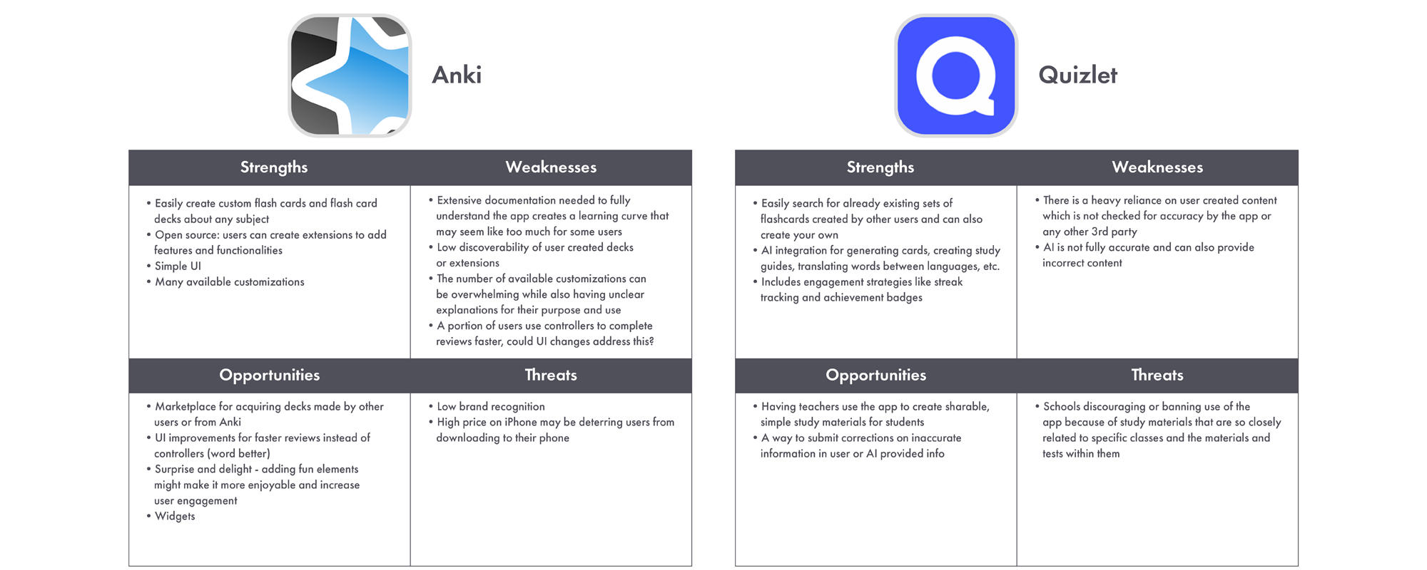
To analyze the insights I gained while looking into these apps, I completed a SWOT analysis of each, noting how they functioned, what they are doing well, and what they are lacking or could improve upon. This helped me clearly organize and keep top of mind the most important details about each app and see where there were possible gaps or strong points to build off of when beginning work on this new app.
Research
While doing my competitor analysis, I encountered some terminology specific to flashcard use, cyclical learning, and knowledge retention. One term I ran across quite often was spaced repetition and I felt it was important to better understand this and how it worked to make the app as effective as possible.
Spaced repetition is a method of learning in which participants review information at intervals that begin close together and become more spread out as one becomes more confident in their recall and as time goes on. In spaced repetition, reviews are timed to stay ahead of the forgetting curve, or the point where people tend to forget information they have learned, without being too soon and over reviewed or too far out and actually forgotten. Understanding this concept felt fundamental for creating an app to help with knowledge retention.
Create & Test
Low-Fidelity Prototype
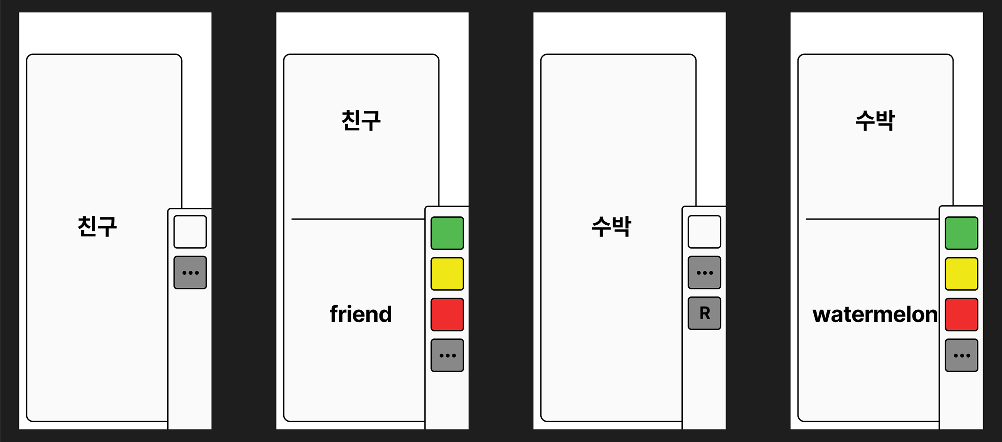 The most important element of an app centered around flashcards is of course the interface of the flashcards and how the user interacts with them. Because of how important this is to the overall success of the app, I decided to test a very simplified version of this as soon as possible and to make sure this function was headed in the right direction. I thought placing the interactive buttons to one side of the flashcard may help a user move through their review quicker by allowing them to study one handed and wanted to test this idea. To do this, I created a barebones, low-fi prototype of this layout in Figma and had a small number of users try it out.
User Flow Maps
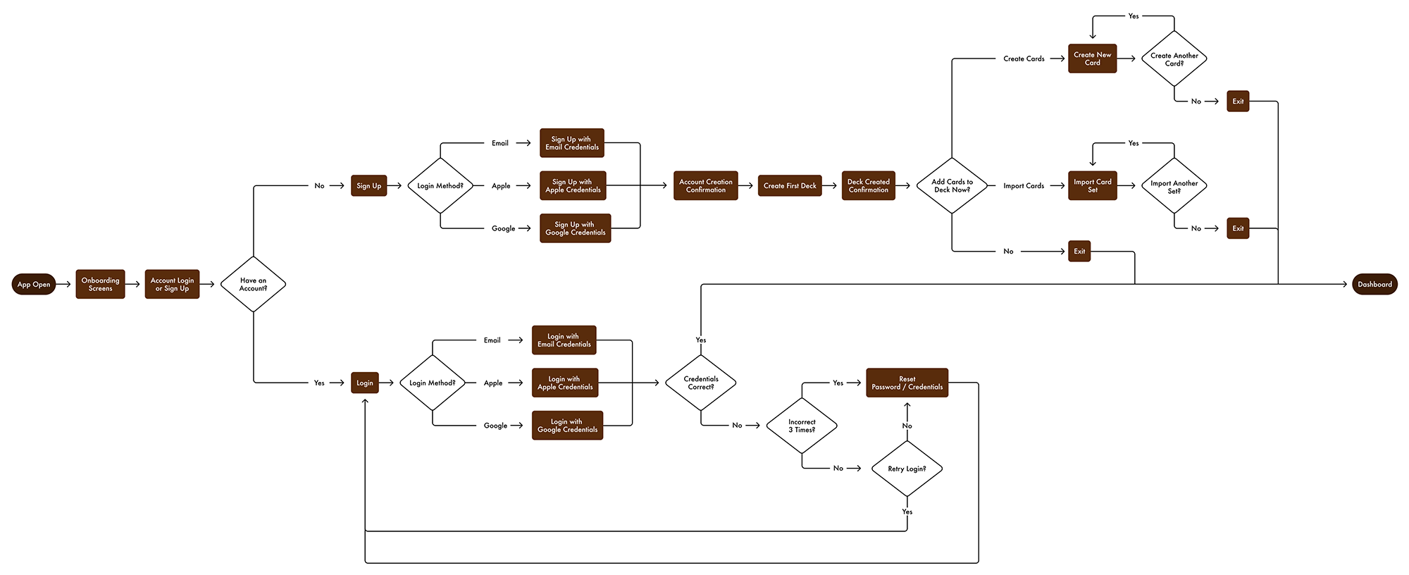
From App Open To Dashboard User Flow
Returning User Flashcard Review Flow

New User First Flashcard Review Flow
 Before I moved into creating a higher fidelity prototype of the app, I felt it was important to get a solid idea of the tasks and decisions a user would encounter and how these would lead them through the app. To do this I created user flow maps, plotting out the movement of users through the app in three important scenarios: a user getting from app open to landing on the dashboard, a regular flashcard review session, and the very first review session completed by a new user. Having the right screens and content in these scenarios are key to the app's success so plotting out a potential user's movement through them gave me a good idea of what to include to make things as efficient as possible.
High-Fidelity Prototype
 At this point I felt I had enough information to move forward with creating the high-fidelity prototype of the app. I used feedback from the low-fidelity prototype of the flashcard and its button placement to adjust and refine the design further. I also used the user flow maps to decide what screens I needed to build out and what their main function would be. As this is a prototype, I didn't want to build the whole app out but instead build enough to get a good idea of how the app is working in key sections and how to improve any shortcomings found. Getting this feedback would also then help to further build out more of the app as needed.
User Testing
Tasks
I observed a small number of users completing a few tasks using the built out high-fidelity prototype. The tasks I chose to include are more directed since the app's simplicity left little room for exploratory tasks and were also limited to Figma's capabilities. These tasks include:
- Explore available resources to learn more about the apps functionality.
- Are there any flashcards for the word “friend” in any decks for foreign languages?
- Are there any flashcards currently due for review?
- Complete the Spanish deck review for today.
Open‐Ended Questions
As part of the session, I also asked two interview questions to get further insight into how the app could work better for them and gauge their first impression of the app after using it. The questions I asked were:
- What factors would make it easier for you to fit using a learning app into your everyday life?
- After using this app, how would you describe it to a friend?
Implemented Improvements
There were several things I observed while people interacted with the app. A few of them include:
- Original buttons to flip the flashcards between the front and back were labeled with the words "show" and “hide” which was not clear to users without explanation. These buttons were changed to use arrows instead to indicate their intent more clearly.
- Originally included a limited number of slightly more complex options for customizing spaced repetition but it was confusing to users and felt unnecessary in the end as it strayed from the apps goal of simplification.
- Expanded the tutorial to include more information and make it clearer.
Solution
Final Returning User Flow
The final flow prototype, built in Figma, showing a returning user going from log in to completing a review and also featuring functions like editing and searching flashcards. (This is an ideal flow built to showcase the UI and functionalities of the final app prototype.)
Final New User Flow
Another flow prototype from Figma, this time showing a new user going from onboarding, through the review tutorial, to finally completing their first review. (This is an ideal flow built to showcase the UI and functionalities of the final app prototype.)
Flashcard Interface and Interactions
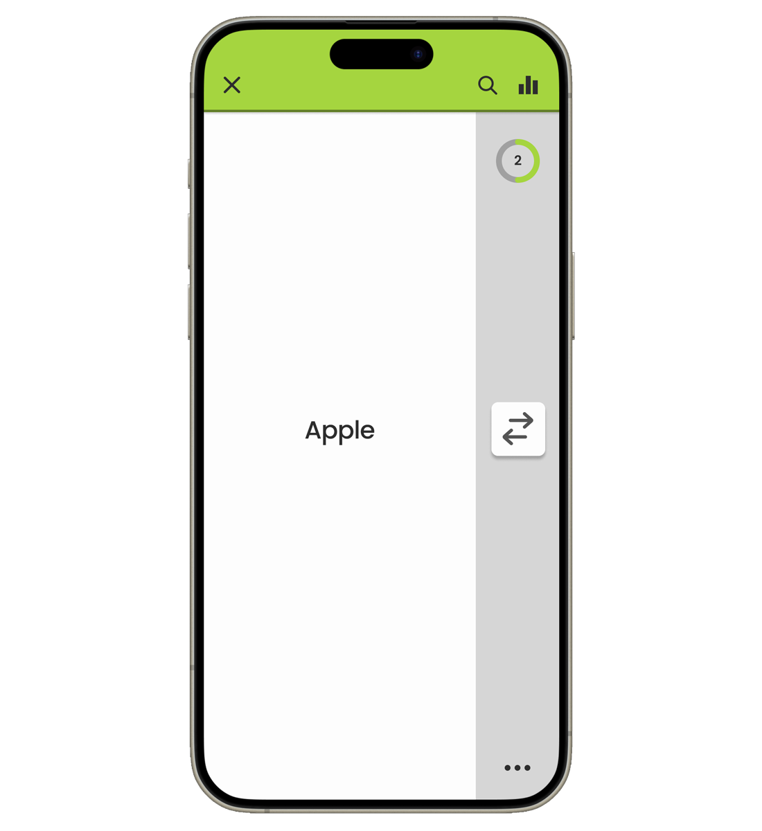 Screen for the Front of Flashcard
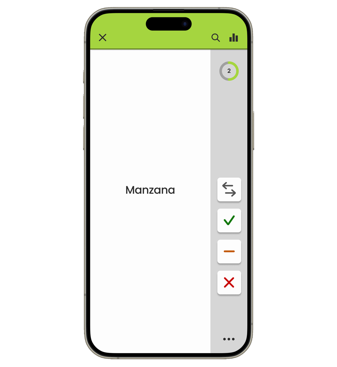 Screen for the Back of the Flashcard
After testing the low-fidelity prototype of the buttons on the side, I decided to move forward with this approach to the UI. I wanted to keep the interface simple and straight forward so that the user could be really be focused on their review. To help this, I only included what felt absolutely necessary and used color to add interest and fun but also to indicate what deck you are currently reviewing without the label as a distraction.
The UI feedback from interactions with the flashcard buttons is minimal and swift, with a subtle indicator inside the progress circle reflecting what button the user answered with as the circle progresses forward. This is to avoid distraction so they can remain focused on continuing their review while also providing some feedback that their answer was received correctly. Ideally in the full app, haptic feedback could be an option as well.
Beyond this prototype, if there were a fully realized version of this app I would ideally include the option to switch the flashcard buttons to the left or right side to aide the usability for left-handed vs. right-handed users but also just for situational convenience. I did test the buttons on the left with a left handed user and this worked well for them, but more data would be needed for this. I also think the ability to drag the button block up or down slightly to fit how one uniquely holds their phone would be an interesting idea to test as well.
Flashcard Tutorial
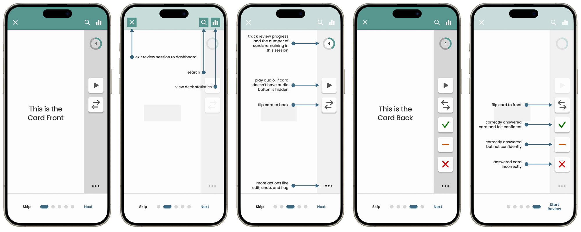
To make sure how to navigate the flashcard interface is as clear as possible, I created a quick but thorough tutorial to highlight and explain the different elements. When a new user initiates their first review, they are first asked if they would like to go to the tutorial before beginning or go straight into the review. They are also assured they can always find the tutorial in the menu at any time in the future if needed. Including this tutorial and strategically prompting the user to view it helps avoid possible confusion before it happens while also providing a permanent help resource if it ever does occur in the future.
Creating, Editing, and Tracking
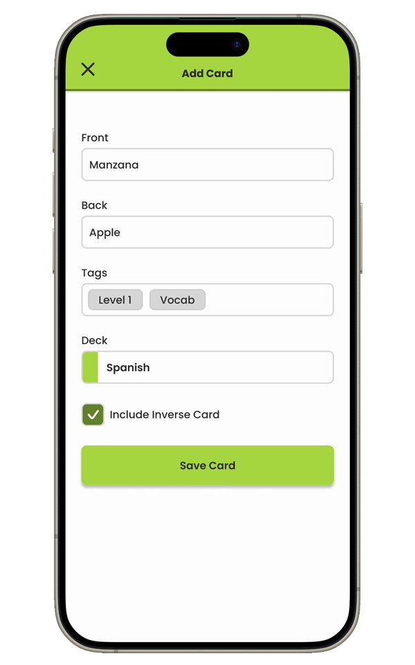 Add New Card Screen
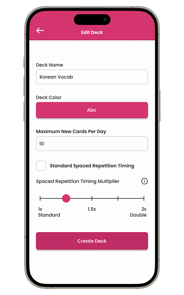 Edit Deck Screen
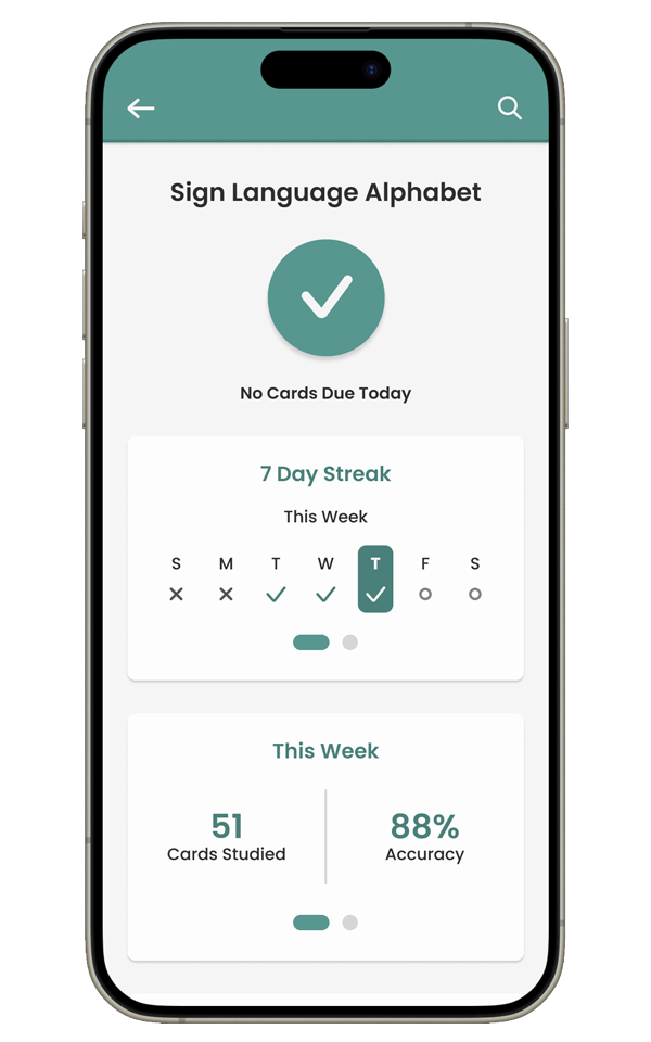 Deck Statistics Screen
Because one of the goals of the app is to avoid too much complexity, only options that are absolutely necessary are included in the screens for adding or editing decks and cards. The idea is that the app will take care of more complicated settings behind the scenes, such as setting review timings algorithmically without the user having to worry about it. Then if there are more complicated options available, a clickable information icon is added that opens a pop up with an in-depth explanation of it to help the user better understand it.
The deck statistics screen is also simple in what it includes but still shares and tracks a fair amount data about the deck and reviews. In my research and learning more about spaced repetition, I knew that users would most likely end up with days without any cards due for review and hesitated to add a streak tracker because of this. However, I ultimately felt that having the streak tracker was such a strong tool for engagement and motivation that including it was important even with the nuance of inevitable "no card days". Users get credit for days with no card review due, as technically they have completed what they are supposed to, and hopefully get a boost of motivation to keep learning even on their days off.
App Onboarding
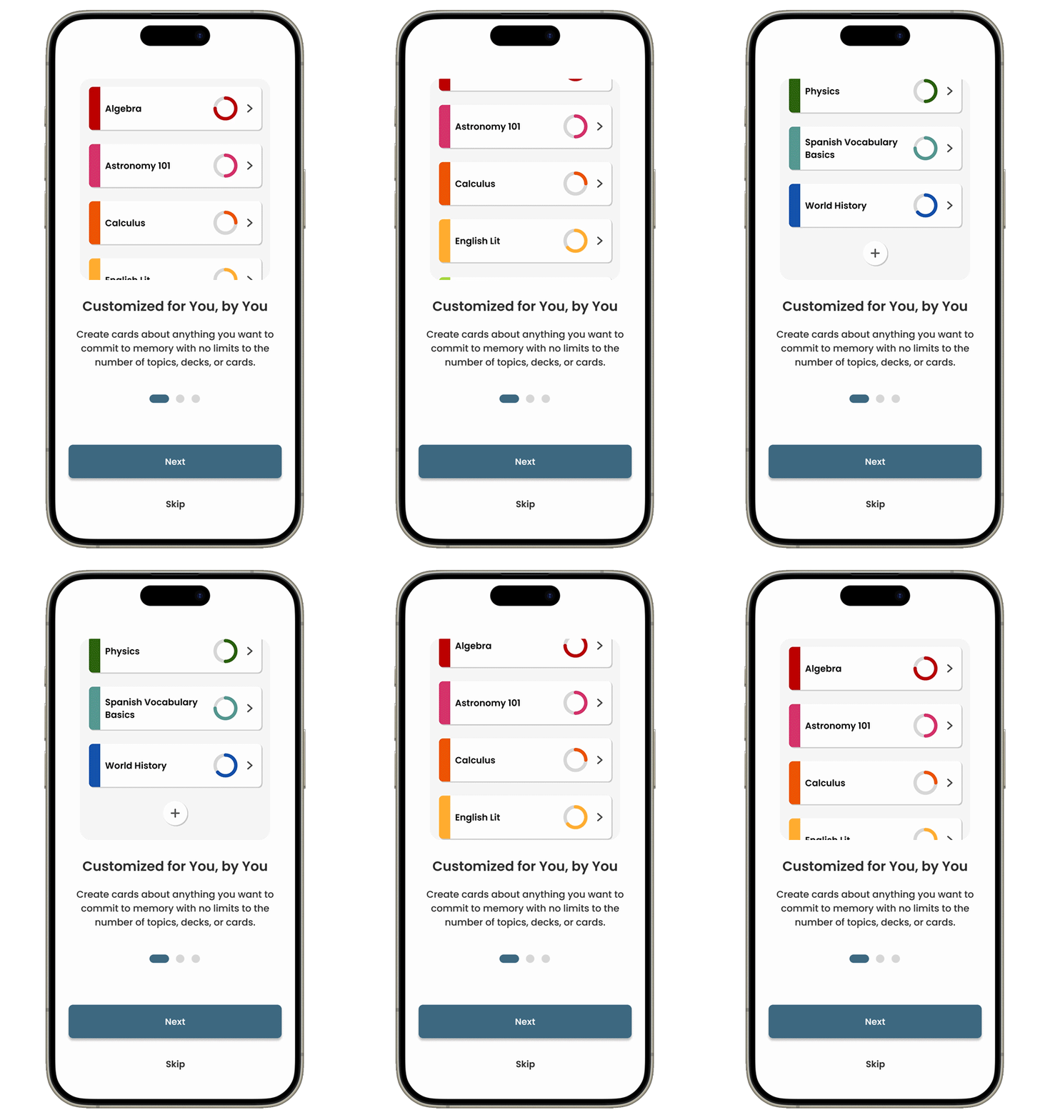
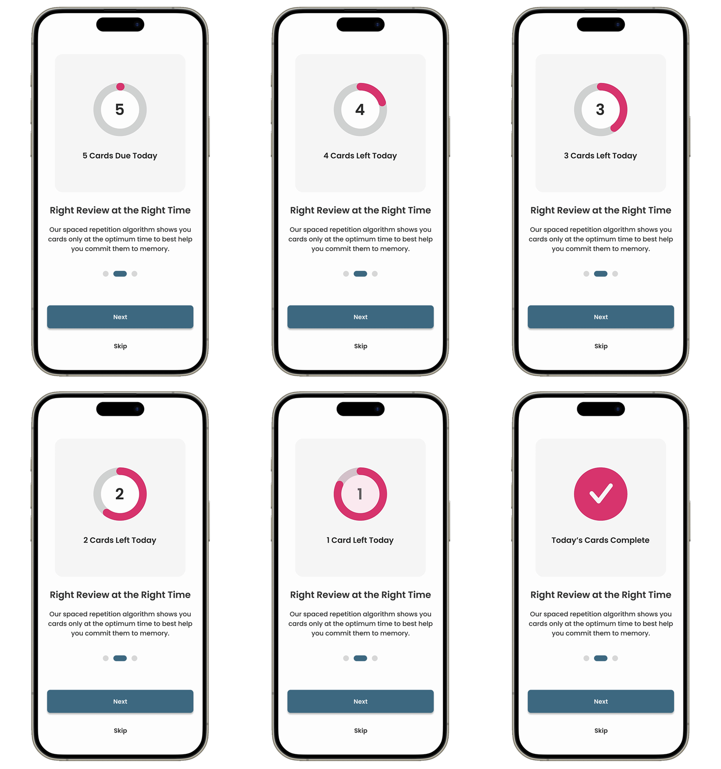
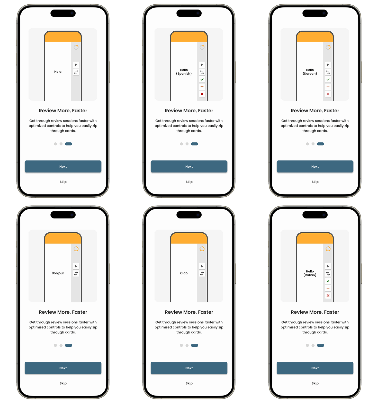
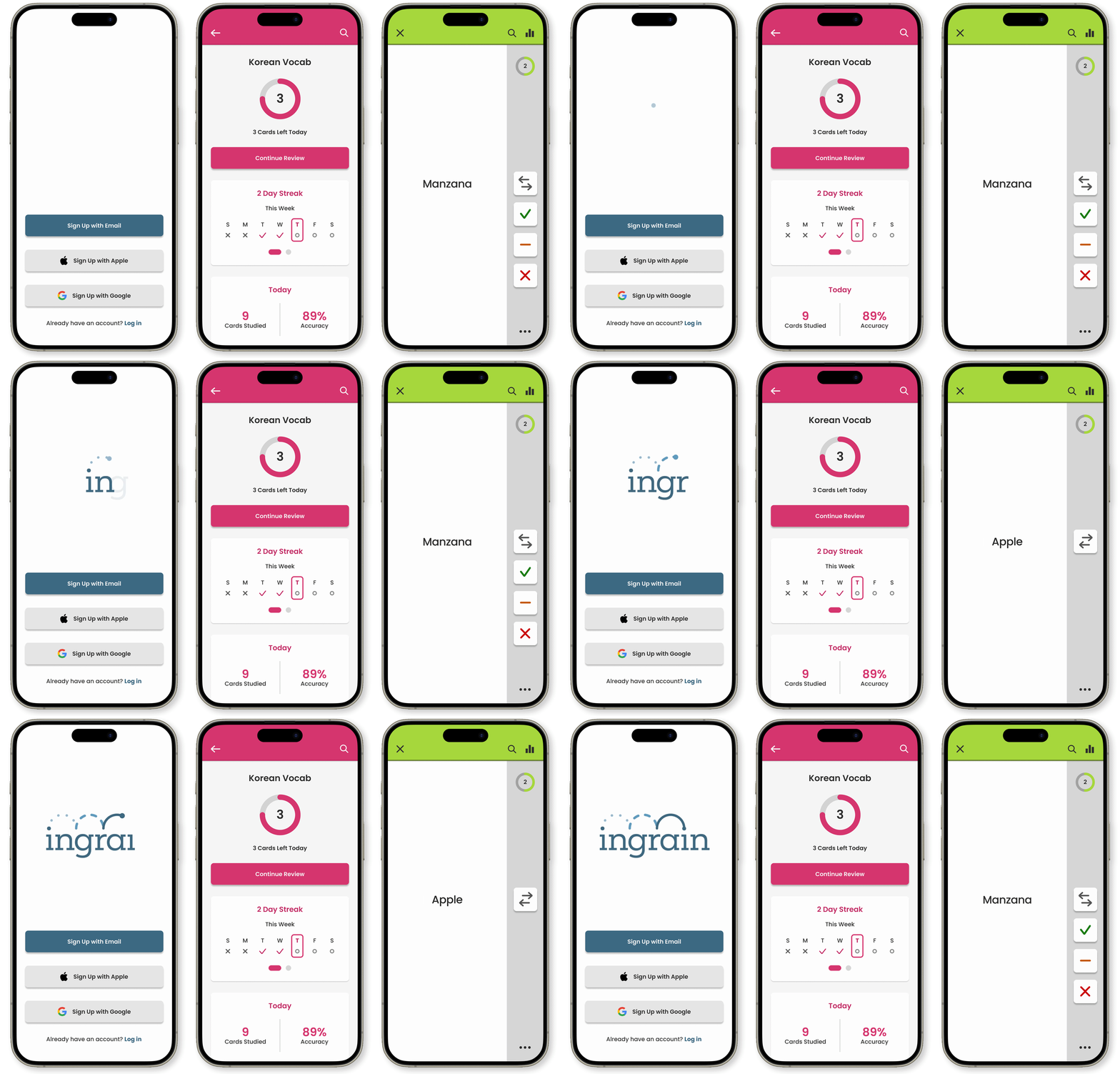
As one of the main objectives of the app was to be straight forward and easy to understand, I wanted to make sure there was a quick onboarding when opening the app for the first time to give a light and general introduction to the app and some of it's features. Each step includes a very simple animation to highlight these features. I also felt like this could add some surprise and delight and potentially add to the user's enjoyment of the app.
Branding & Color
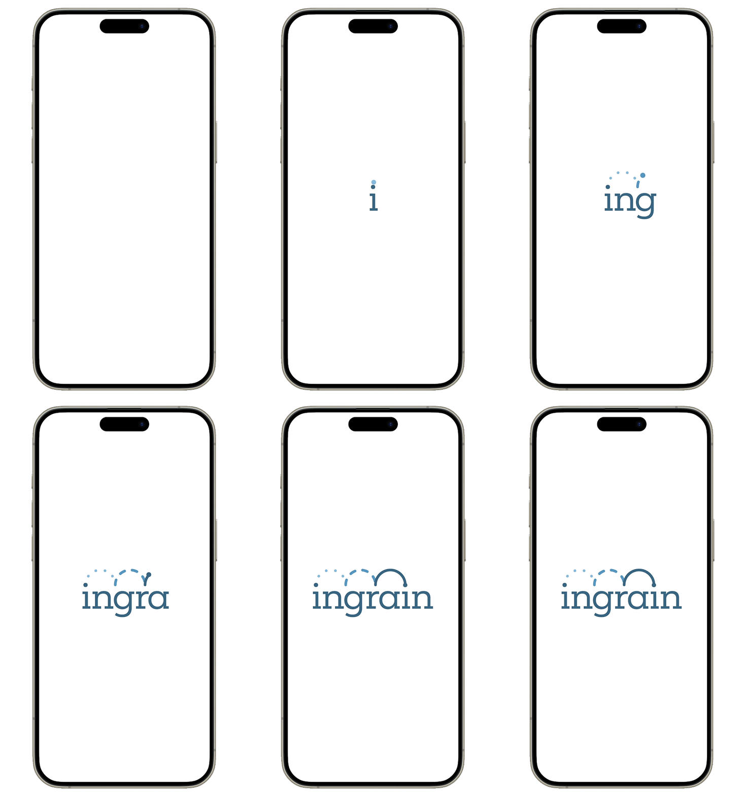
I wanted the design of the Ingrain logo to reflect the repetition of the app's flashcard reviews and the positive outcomes they can lead to. To express this, I included 3 arches: the first in dots, the second in dashes, and the third a solid line, with the color becoming darker with each arch as well. The way the arches repeat, solidify, and darken represent the strengthened retention of knowledge in the user's mind over time via repeated review in the app.
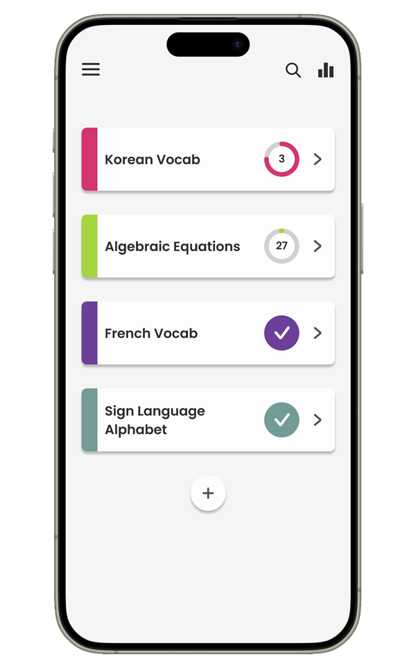
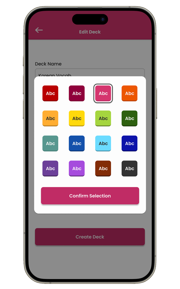
One of my observations when looking at Anki and Quizlet was the lack surprise and delight in their layout and the scaled back, monotone look of them overall. I understand this approach and feel it may have been taken to help users better focus on the material without being distracted. However, I think users would still be able to focus if there were some more fun and interest in the design. To add this, I decided to make color a big part of the app design and have users pick a color for each of their decks. Once assigned, the deck's color is used across everything associated with that deck, including during reviews. Having the color one remain a consistent presence during card reviews allows it to fall back and let users concentrate on their reviews while still adding some fun and interest. There are no rules for the colors, so they could be reused to tie different decks together or make their dashboard reflect a certain aesthetic — however they choose to use it.

